DesignUIAccessibility
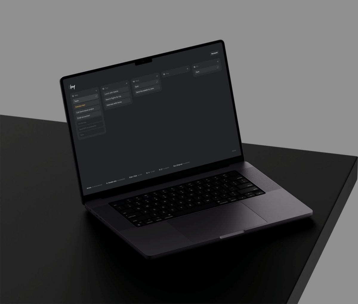
Dark mode is not simply inverted colors. When you flip a palette, contrast and hierarchy collapse, and the product looks flat or overly harsh. Dark mode needs a new set of values that are tuned for low light.
Instead of pure black, use deep neutrals. Instead of pure white, use slightly muted text so the eye can rest. Accent colors should be rebalanced so they do not glow too aggressively on dark surfaces.
The reward is a mode that feels intentional rather than forced. When dark mode is treated as its own environment, users notice the care and trust the interface more.